Guía 12
Objetivo general
Desarrollar un dashboard interactivo y visualmente intuitivo utilizando tecnologías web modernas, como React, que permita a los usuarios monitorear en tiempo real métricas clave del clima.
Actividades en clases
- Clona localmente tu repositorio dashboard.
Componente IndicatorWeather: Estructura básica
- Cree el archivo src/components/IndicatorWeather.tsx.
-
En src/components/IndicatorWeather.tsx, con el siguiente código:
- Un elemento vacío (Fragment) con el texto
Componente IndicatorWeather:
export default function IndicatorWeather() { return ( <> Componente IndicatorWeather </> ) } - Un elemento vacío (Fragment) con el texto
-
En App.tsx:
- Importe el componente IndicatorWeather, y
- Coloque la referencia al componente
<IndicatorWeather />en el Grid.
import IndicatorWeather from './components/IndicatorWeather'; function App() { return ( <Grid container spacing={5}> {/* Indicadores */} <Grid size={ ... }> <IndicatorWeather /> </Grid> <Grid size={ ... }> <IndicatorWeather /> </Grid> <Grid size={ ... }> <IndicatorWeather /> </Grid> <Grid size={ ... }> <IndicatorWeather /> </Grid> ... </Grid> ) } export default App - Versiona local y remotamente el repositorio.
- (STOP 1) Compruebe el resultado en el navegador.
Componente IndicatorWeather: Propiedades (Props)
-
En src/components/IndicatorWeather.tsx:
- Agregue la interfaz Indicator con las claves title, subtitle y value,
- Defina config del tipo Indicator, como props del componente, y
- Renderice las claves title, subtitle y value
... interface Indicator { title?: String; subtitle?: String; value?: String; } export default function IndicatorWeather(config: Indicator) { return ( <> {config.title}<br/> {config.value}<br/> {config.subtitle} </> ) } -
En App.tsx:
- A cada componente IndicatorWeather, agregue las propiedades y los valores correspondientes.
import IndicatorWeather from './components/IndicatorWeather'; function App() { return ( <Grid container spacing={5}> {/* Indicadores */} <Grid size={ ... }> <IndicatorWeather title={'Indicator 1'} subtitle={'Unidad 1'} value={"1.23"} /> </Grid> <Grid size={ ... }> <IndicatorWeather title={'Indicator 2'} subtitle={'Unidad 2'} value={"3.12"} /> </Grid> <Grid size={ ... }> <IndicatorWeather title={'Indicator 3'} subtitle={'Unidad 3'} value={"2.31"} /> </Grid> <Grid size={ ... }> <IndicatorWeather title={'Indicator 4'} subtitle={'Unidad 4'} value={"3.21"} /> </Grid> ... </Grid> ) } export default App - Versiona local y remotamente el repositorio.
- (STOP 2) Compruebe el resultado en el navegador.
Componente IndicatorWeather: Componente MUI Paper y Typography
-
En src/components/IndicatorWeather.tsx:
- Agregue la referencia a los componentes Typography y Paper
- Reemplace el código renderizado con los componentes Typography y Paper
import Typography from '@mui/material/Typography'; import Paper from '@mui/material/Paper'; interface Indicator { ... } export default function IndicatorWeather(config: Indicator) { return ( <Paper sx={{ p: 2, display: 'flex', flexDirection: 'column' }} > <Typography component="h2" variant="h6" color="primary" gutterBottom> {config.title} </Typography> <Typography component="p" variant="h4"> {config.value} </Typography> <Typography color="text.secondary" sx={{ flex: 1 }}> {config.subtitle} </Typography> </Paper> ) } - Versiona local y remotamente el repositorio.
- (STOP 3) Compruebe el resultado en el navegador.
Componente ControlWeather: Estructura básica
- Cree el componente src/components/ControlWeather.tsx
-
En src/components/ControlWeather.tsx, con el siguiente código:
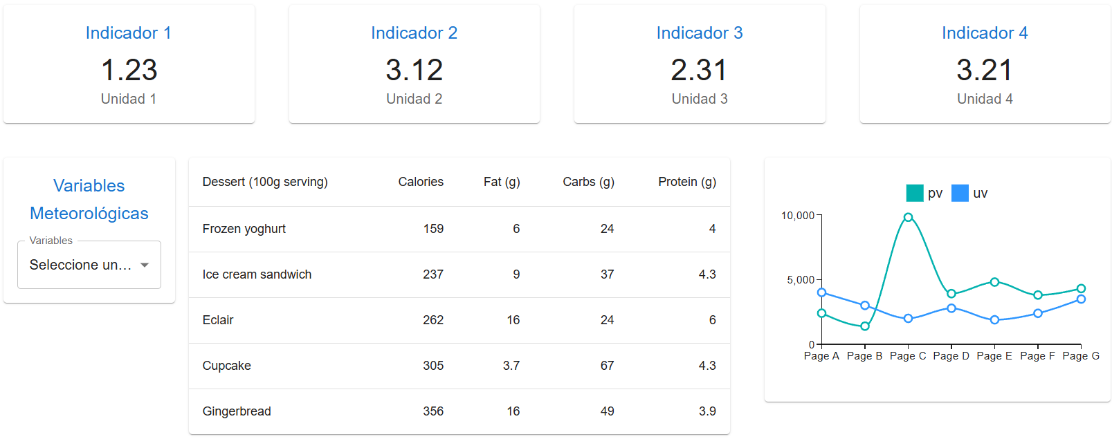
 {/* Componentes MUI */}

 import Paper from '@mui/material/Paper';
 import Typography from '@mui/material/Typography';
 import Box from '@mui/material/Box';
 import InputLabel from '@mui/material/InputLabel';
 import MenuItem from '@mui/material/MenuItem';
 import FormControl from '@mui/material/FormControl';
 import Select from '@mui/material/Select';

 export default function ControlWeather() {

     {/* Arreglo de objetos */}
     let items = [
         {"name":"Precipitación", "description":"Cantidad de agua que cae sobre una superficie en un período específico."},
         {"name": "Humedad", "description":"Cantidad de vapor de agua presente en el aire, generalmente expresada como un porcentaje."},
         {"name":"Nubosidad", "description":"Grado de cobertura del cielo por nubes, afectando la visibilidad y la cantidad de luz solar recibida."}
     ]

     {/* Arreglo de elementos JSX */}
     let options = items.map( (item, key) => <MenuItem key={key} value={key}>{item["name"]}</MenuItem> )

     {/* JSX */}
     return (
         <Paper
             sx={{
                 p: 2,
                 display: 'flex',
                 flexDirection: 'column'
             }}
         >

             <Typography mb={2} component="h3" variant="h6" color="primary">
                 Variables Meteorológicas
             </Typography>

             <Box sx={{ minWidth: 120 }}>

                 <FormControl fullWidth>
                     <InputLabel id="simple-select-label">Variables</InputLabel>
                     <Select
                         labelId="simple-select-label"
                         id="simple-select"
                         label="Variables"
                         defaultValue='-1'
                     >
                         <MenuItem key="-1" value="-1" disabled>Seleccione una variable</MenuItem>

                         {options}

                     </Select>
                 </FormControl>

             </Box>


         </Paper>


     )
 }
Componente TableWeather: Componente MUI BasicTable
- Acceda al componente BasicTable y copie el código.
-
Cree el componente src/components/TableWeather.tsx, y:
- Pegue el código del componente BasicTable.
- Elimine la referencia
import * as React from 'react'; - Elimine la propiedad con el estilo embebido
sxen el elemento<Table />.
Componente Grid: Anidado
-
En App.tsx:
- Importe el componente TableWeather y ControlWeather, y
- Coloque la referencia a los componentes
<TableWeather/>y<ControlWeather />en el Grid.
... import TableWeather from './components/TableWeather'; import ControlWeather from './components/ControlWeather'; function App() { return ( <Grid container spacing={5}> ... {/* Tabla */} <Grid size={ ... }> {/* Grid Anidado */} <Grid container spacing={2}> <Grid size={{ xs: 12, xl: 3 }}> <ControlWeather/> </Grid> <Grid size={{ xs: 12, xl: 9 }}> <TableWeather/> </Grid> </Grid> </Grid> ... </Grid> ) } export default App - Versiona local y remotamente el repositorio.
- (STOP 4) Compruebe el resultado en el navegador.
React MUI X: Instalación
-
Desde la línea de comandos, instale React MUI X con:
npm install @mui/x-charts -
Cree el componente src/components/LineChartWeather.tsx, con el siguiente código:
import Paper from '@mui/material/Paper'; import { LineChart } from '@mui/x-charts/LineChart'; const uData = [4000, 3000, 2000, 2780, 1890, 2390, 3490]; const pData = [2400, 1398, 9800, 3908, 4800, 3800, 4300]; const xLabels = [ 'Page A', 'Page B', 'Page C', 'Page D', 'Page E', 'Page F', 'Page G', ]; export default function LineChartWeather() { return ( <Paper sx={{ p: 2, display: 'flex', flexDirection: 'column' }} > {/* Componente para un gráfico de líneas */} <LineChart width={400} height={250} series={[ { data: pData, label: 'pv' }, { data: uData, label: 'uv' }, ]} xAxis={[{ scaleType: 'point', data: xLabels }]} /> </Paper> ); } -
En App.tsx:
- Importe los componentes LineChartWeather, y
- Coloque la referencia a los componentes
<LineChartWeather />en el Grid.
... import LineChartWeather from './components/LineChartWeather'; function App() { return ( <Grid container spacing={5}> ... {/* Gráfico */} <Grid size={ ... }> <LineChartWeather/> </Grid> </Grid> ) } export default App - Versiona local y remotamente el repositorio.
- (STOP 5) Compruebe el resultado en el navegador.
Documentación
- En mui.com se encuentra la documentación de la librería de componentes visuales para React.
Fundamental
- Nombres de componentes en React
⚛️ Do you know how to name React components with the Base + Composite + Suffix Pattern?
— George Moller (@_georgemoller) November 6, 2023
You can use this pattern to create clear and consistent component names in your projects. pic.twitter.com/xxopzpmvwJ
Términos
component, interface, props
Referencias
- The React component library you always wanted. (n.d.). Retrieved from https://mui.com/
- Your First Component. (n.d.). Retrieved from https://react.dev/learn/your-first-component
- Rwparrish. (2020). React Basics. Retrieved from https://dev.to/rwparrish/react-basics-2je1
- Built-in React Components. (n.d.). Retrieved from https://react.dev/reference/react/components
- Codemarch. (2024). Build a Card Component: pic.twitter.com/AQ6VwHhl20. Retrieved from https://twitter.com/codemarch/status/1745649409436660118?t=kTuhWffwFZ2UJ0oW4V_SEw&s=08